Quantifying Hope on a Global Scale
Hope is a somewhat nebulous word.
For some, it is an expectation of what the future will be. For others, it is a goal for what the future should be. The word itself means something different to each person.
Most generally though, hope describes how one perceives the momentum of the world. Do things seem to be generally getting better, or do they generally seem to be getting worse? Personally, I think things are rapidly getting much, much better.
We Should Be Hopeful
First, let's define our metric. The world is better off when people are better off. The more people who are able to live long, meaningful lives, the better.
In his posthumously published book, Factfulness: Ten Reasons We're Wrong About the World – and Why Things Are Better Than You Think, Hans Rosling made the case that the quality and length of human life has been trending upward for more than a century. Life expectancy at birth has more than doubled in the last century alone. The portion of the global population living in poverty is lower than any point in history.
Side note: a great resource to learn about this is Our World In Data's comprehensive, yet approachable report.
All of this progress does not mean we should just stop here and say the work is "done." However, I believe that often the best approaches to solving world-scale problems (like poverty) start by first looking at the solutions that already work.
In the book, Rosling tells how he is often described as an "optimist." He thinks it is a misnomer, since optimists are often portrayed as foolish and misinformed. He, however was likely more qualified than anyone to speak on the possibilities of the likely good future, so his positive outlook was entirely justified. For this reason, he described himself a "possibilist". While I don't even approach his qualifications, I would similarly describe my worldview as "possibilist."
The Solutions That Exist
I've spoken on the topic of solution-focused thinking before, but I think it warrants revisiting. I don't want this to be the focus of my writing today, but I do want to provide a brief example of the kind of solutions that exist today that are having profound, real-world impacts.
One of the critical environmental problems is related to recycling. Every year, 18 million tonnes of trash is leaked to the environment, including our oceans and rivers. According to AMP Robotics founder Matanya Horowitz, this trash can actually be a hugely profitable commodity. Depending on market conditions, one ton of recyclable material can be worth up to $100. The issue: the cost of sorting the material into a usable form is often also around $100, most of which is spent on human labor. Since the cost of processing the material to prepare to sell is about the same as it's sold price, there is little economic incentive to do much recycling. In the case of plastics recycling, the issue is not that people don't recycle enough. It is that the cost of recycling the resulting material is too high.
So what does AMP Robotics do? They have automated the process of recycling, bringing down the costs precipitously. With robotics, the cost of recycling (to the waste company) is now much lower than the actual sold price of material, making it an extremely profitable business.
I think this is a great example for two reasons. First and foremost, we are often told, without much substantiating evidence, that the problem of ocean plastics and pollution are the result of individual people choosing not to recycle. In reality, however, the limiting factor is not on the individual, but the waste management company's efficiency.
Quantifying Hope
I've established that the world is becoming a better place to live for almost everybody, all the time. I've also made clear that this positive change is the result of solutions that get reported on (by the news) less frequently than the problems they solve. With that done, I think it is time to return to the topic of hope.
My end goal was to automate the process of finding solutions that worked (like AMP Robotics). I understood that this would be an enormously difficult natural language processing task, so I decided to start simple. The plan: I would first quantify how hopeful a given news article was, then work from there.
Web Scraping
The first step was to write a system that could retrieve recent, important news articles reliably. There is already infrastructure on most news websites that makes this pretty easy: RSS. By regularly iterating through a list of RSS feeds, we can get pretty good news coverage for most of the world. Additionally, news organizations prioritize the content of their RSS based on what they think is important.
My initial implementation was in Rust, which I will show here. As you can see, I spent some time parallelizing the scrape job. This was primarily to reduce the amount of time it would take to iterate on the hope quantifying algorithm, so I could get close to real-time feedback on it when I made changes.
use rss::{Channel, Item};
use tokio::sync::mpsc::unbounded_channel;

/// Download all items from an RSS Feed
async fn get_feed_url_items(url: &str) -> anyhow::Result<Vec<Item>> {
    let content = reqwest::get(url).await?.bytes().await?;

    let channel = Channel::read_from(&content[..])?;
    Ok(channel.into_items())
}

/// Download all items from a list of RSS feeds, in parallel.
pub async fn get_all_feed_urls(urls: impl IntoIterator<Item = &str>) -> anyhow::Result<Vec<Item>> {
    let mut items_receiver = {
        let (items_sender, items_receiver) = unbounded_channel();

        for url in urls {
            let url = url.to_string();
            let items_sender = items_sender.clone();
            tokio::spawn(async move {
                items_sender.send(get_feed_url_items(&url).await).unwrap();
            });
        }
        items_receiver
    };

    let mut res = Vec::new();

    while let Some(items_res) = items_receiver.recv().await {
        let mut items = items_res?;
        res.append(&mut items);
    }

    Ok(res)
}
Rewriting into .NET Core
Now that I've found a relatively high quality source of raw data to estimate public opinion, I need to condense it into a single number, and look at how it changes over time. It was at this point I rewrote most of the code into C# and ASP.NET Core. I had four reasons for this:
- While I've used ASP.NET Core and Entity Framework Core in the past, I haven't used it recently. I wanted to see how the ecosystem has changed in the intervening time.
- Evaluate the tech stack for other projects.
- Entity Framework Core is a great ORM, and I may be able to apply its ideologies to other technologies, even if I don't continue using it directly.
- In order to evaluate positivity over time, I need as much historical data as possible, which should be stored in a persistent database.
One main drawback of ASP.NET Core is the amount of boilerplate necessary. As a result, I am hesitant to show any clippings from the rewrite, as it takes a lot of space without adding much value to the discussion here. However, all the code for this project is open source and available on GitHub.
Here is the gist of the overall process the re-written app goes through:
- Scrape a number of RSS feeds with the method already discussed.
- Store headlines in a table in an SQLite database, along with timestamp of the retrieval and the source URL.
- Repeat the first two steps every two minutes, checking and removing duplicates.
Finally: The Hope Algorithm
Finally, we can discuss the actual algorithm.
First, I would run the VADER sentiment analysis algorithm over each headline from the last month to evaluate their positivity. Since VADER returns three values, a "positivity" rating, a "negativity" rating, and a "neutral" rating, I consolidated them into a single number by simply subtracting negativity from positivity.
Next, I find the average of the subset of the positivity score from the past two hours and subtract the average from the last month. Finally, I use the month's standard deviation to place it on a scale of 0-100, where 50 is average. Here is the formula, where is the positivity mean from the last two hours and is the positivity mean from the last month.
Naturally, there are a few things to note about this formula. I assumed that the positivity score is a normal distribution among news headlines (I did not have time to evaluate whether this is actually true). The score will also often fall outside the range of 0-100. This is expected, since values outside that range will be less accurate anyway. In those situations, I simply clamp to within the range 0-100.
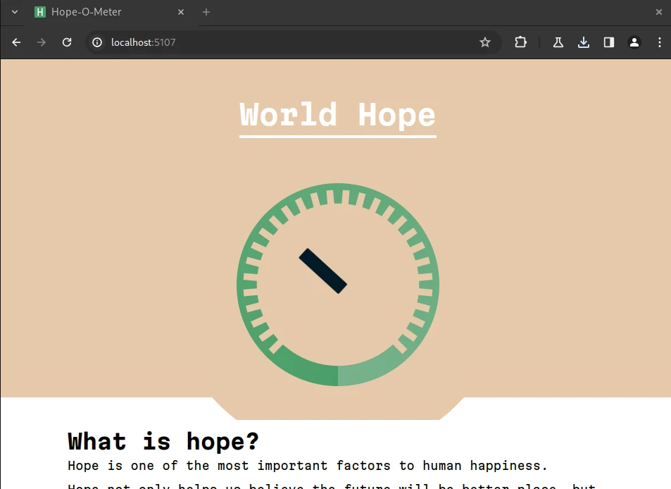
Communicating Hope
I wanted to explore and get feedback on a couple different ways of communicating abstract concepts of hope. First, I threw together a quick website using Svelte and TailwindCSS.
I ran the website for a couple of days and had friends, family, and peers test it out to get feedback on the concept.
Feedback
The people I spoke to had a lot to say on the dial itself. Notably, the lack of +/- signaling was confusing. People couldn't tell what a "good" or a "bad" reading on the dial looked like. One person suggested I include a happy face on the hopeful side and a sad face on the despair side.
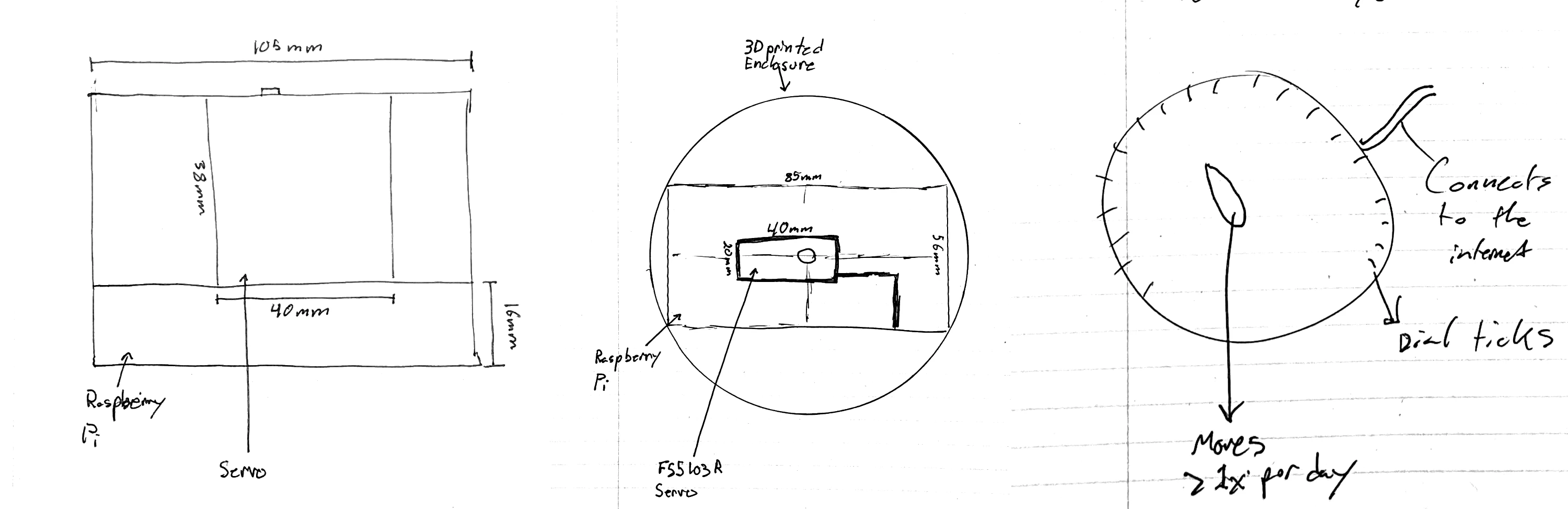
We brainstormed the different places we could put a hope-meter. IOS and Android both support home-screen widgets. Maybe we could put a global hope-meter on one of those, right next to the clock? Maybe you could click on a specific spot on the hope meter, and you would be served a news article with that amount of hope? The possibilities were endless. I was pushed to look into what a physical hope meter would look like, so I sketched it out.
Moving To the Real World
I got hooked on the physical dial. I wanted something tangible that I could put somewhere. Something whose physical weight would give an amount of substance to the thing it measured.
I decided to keep riffing on the sketches I had drawn out. I loaded the web server I used for the original site onto a Raspberry Pi 3, planning on using the existing HTTP endpoint to control a servo, which in turn, moved a hand on a dial.
The only material I needed to buy was a FS5103R continuous rotation servo. I already had access to everything else. While I was waiting on that part to arrive, I modeled out what the physical device could look like. Initially, I imagined something like this:

All the electronics would be placed inside the bottle, and the servo would be attached to the cap. The entire contraption would rest on it's side. In hindsight, there are a couple of issues with this concept. The circular body would cause it to roll all over the place, and the complete lack of access to the inside would make maintenance quite difficult. That isn't even to mention there isn't a single hole for a power cord in this model for the electronics.

In the final model (pictured above), I included facial expressions to differentiate hope and despair on the dial. I also completely removed the enclosure, instead planning on directly attaching the Raspberry Pi and servo to the back of the dial.
The Print
With the model complete, I went to my local makerspace, and printed it out. How did it go? Not so well.
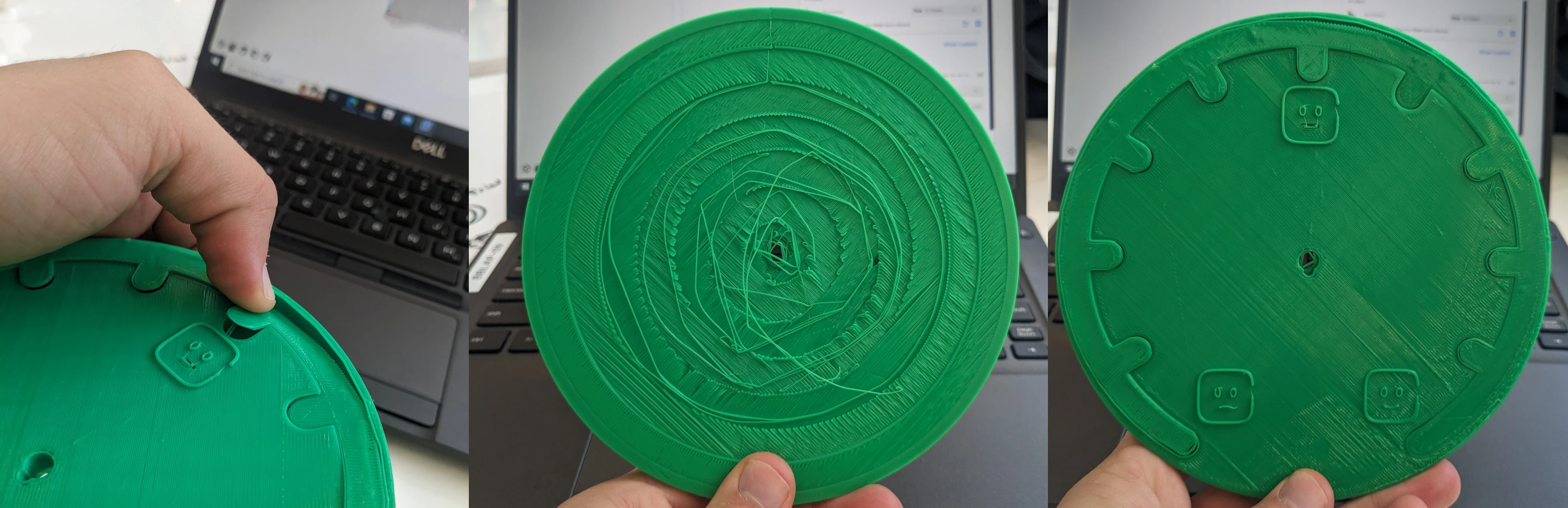
The first print failed spectacularly. Parts were coming off, and it looked like it was drawn with one of those 3D pens. Turns out, the issue was that the underlying 3D model had not been exported out of Blender (the 3D modeling software I used) properly, and the geometry was screwed up before it even entered the slicing software. Garbage in, garbage out, I suppose.
The second print, however, turned out great. I hot-glued the Raspberry Pi to the back, plugged in the servo, and we were off to the races. As you can see above, I programmed a little servo control script in Python, which included a little startup motion. After the motion is completed, it moves to the current hope value.
The video was recorded right after the Isreal-Hamas War began, so global hope values were not doing so hot. Although it truly is a tragedy, if anything, this is evidence that the system works.
Reflection
This project stretched my abilities in a couple key ways.
After the initial prototyping phase, all the code was in programming environments I am relatively unfamiliar with. While I have a lot of experience with Node.js, Rust and React, I felt some difficulty when working with ASP.NET Core and Python. The difficulties were exacerbated when trying to run everything on a Raspberry Pi, which I have never worked with in this capacity.
Additionally, I found it pretty difficult to get the servo working reliably. Apparently, servos rely on a potentiometer to stay calibrated. If the potentiometer moves to an ambient environment with a different temperature than it was calibrated in, the servo starts to move in unexpected ways. This resulted in frequently inaccurate readings. If I could go back and re-do this project, I would have used a different kind of motor, maybe a stepper motor.
Part of my motivation for doing this project was to gather more information on the best way to implement a climate change progress bar. To that end, I found this quite successful. I now have a better understanding of what kind of server and database architecture I want to use. I also now know what kinds of formats people are more likely to see global metrics like hope or climate progress (home screen widgets and push notifications are at the top of the list).
Published October 20, 2023 at 6:00 AM
Proofread by Harper.
Comments
Other Stuff
Hacker News sans AI
I like HackerNews, but I don't love that so much of it has turned into discussion of a single topic: AI. This is a version of HackerNews, filtered to remove any article focusing on __AI__. Refreshes about every ten minutes.
Markov Chains Are the Original Language Models
Back in my day, we used math for autocomplete.
Why I Talk to Myself
It's not easy, but I think it's one of the best habits I've ever built.