The Climate Change Progress Bar
The Problem
Over the last couple years, I've noticed a growing distinction between two groups of people.
On one hand, we have those who deny climate change is a problem. Some believe it is a hoax, while others merely don't grasp the gravity of the situation. This perspective is misinformed.
On the other hand, there are some who believe climate change is a problem beyond their abilities to impact. They believe that, as mere individuals, there is not a single thing they can do that could have a meaningful effect toward reducing carbon emissions. This perspective is equally misinformed.
In reality, the climate problem is huge. It will result in massive habitat losses for human life and wildlife. In all likelihood, hundreds of millions of people will lose the ability to farm their land, either from drought, floods, lost soil fertility or wildfires.
Side Note: If you want to learn more about human migration in the 21st century, I highly recommend the documentary Climate Refugees.
The point of this article is not to convince you that climate change is a real problem that has real solutions. At this point, I don't need to tell you that the climate problem is actively being solved by some of the most courageous, influential, intelligent minds in the world. There are solutions out there that are having a huge impact, but people don't have a straightforward way to discover them.
The problem I want to solve is this: there is no single metric or dashboard to see the progress of climate change and its solutions.
What's the Pitch?
As I am sure you figured out from the title, I want to make a progress bar for climate change. A single place people can go to see where we, as a planet and as a species, stand. Functionally, I want to replicate how we can view federal government's debt in real time, but for climate change.
I've conversed with a friend of mine, Anyll Markevich, who knows much more about climate issues than I do. While we would obviously need multiple rounds of peer review before we can put anything of substance out, Anyll has recommended I start my research in a couple specific areas.
Planetary Boundaries
There exist some projects and tools that hold a similar goal as the climate change progress bar. The closest I could find was the Planetary Boundaries project.
When having an argument with someone, there are some lines you just cannot cross. Some lines are unavoidable. Godwin's law states that "as an online discussion grows longer, the probability of a comparison to Hitler approaches 1." While comparing your argumentative opponent to a genocidal dictator is almost never necessary or useful, the line gets crossed eventually.
The planet's ecosystem is similar. There are certain ecological lines that cannot not be crossed, like having more than 10 extinctions per million species in a year, without significant impact on global ecological health. The planet can handle a certain amount of carbon dioxide in the air, but it cannot handle more than 350 parts per million without significant damage occurring. At the time of writing, is currently at 418 ppm.
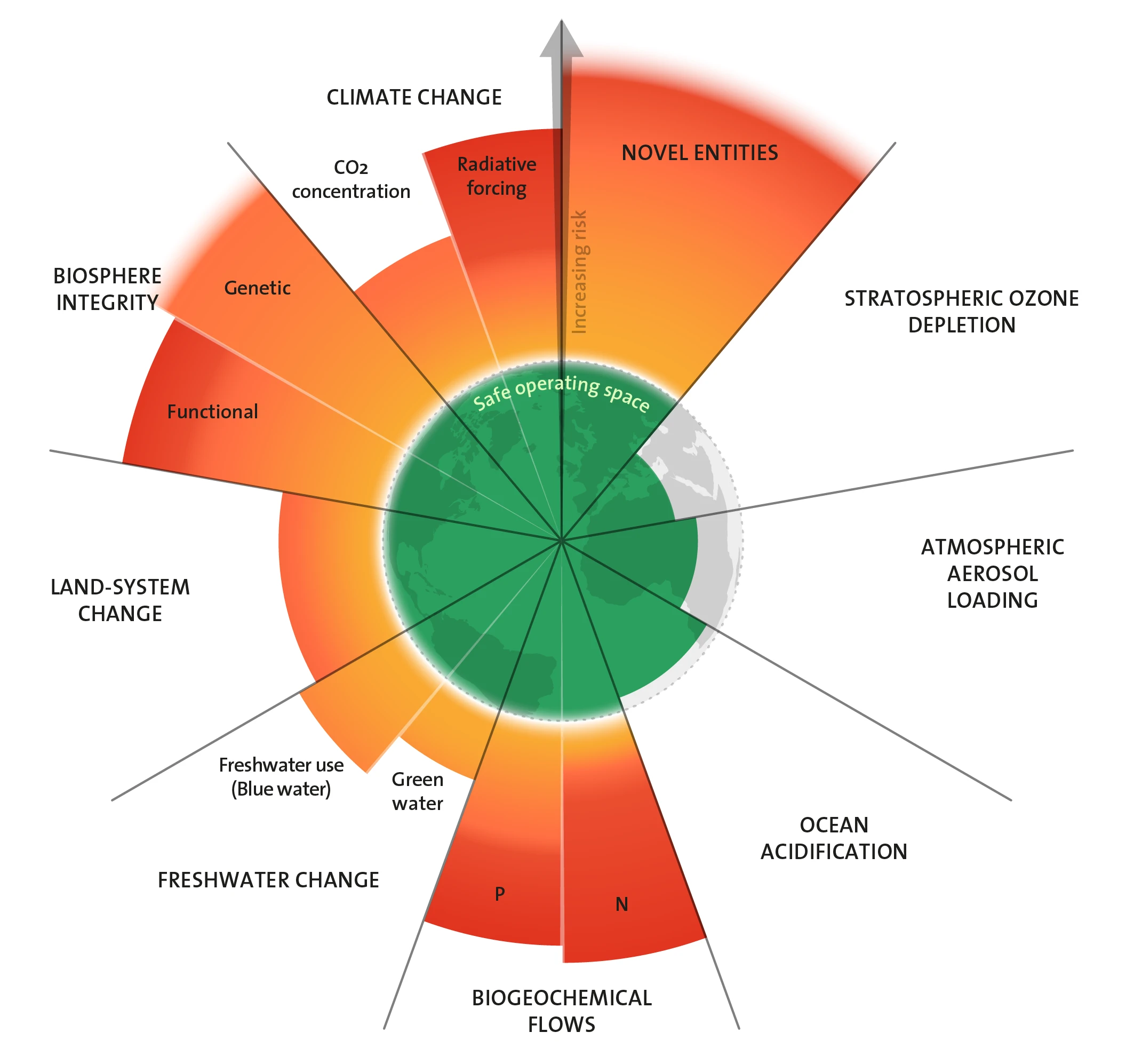
The above graph shows where the planet is on several planetary boundaries. As you can see, we've exceeded most of them.
While planetary boundaries are a great way of communicating where we are on a bunch of environmental metrics, it falls short of our goal in a few key ways. For one, it doesn't specialize in climate change. While it does show current carbon dioxide levels, it doesn't include any other greenhouse gases, or how deepy they are effecting global temperatures. Finally, it is only updated annually. The Climate Change Progress Bar's key trait is that it is real-time, so people can see how we stand in the climate battle right now.
Possible Data Sources
This is something I need to speak to more climate experts on. However, at the bare minimum there are a few elements our technology can look at.
Real Time Carbon Data
Anyll suggested I look into the Carbon Monitor, a real-time carbon emissions' dataset. Since it doesn't look like their API is accessible, but their code is, it looks like we can just run in on our infrastructure. I need to look into the technical implementation details a bit more, but initial prospects are good.
Normalized Difference Vegetation Index
NDVI is an industry-standard way of measuring the photosynthetic productivity of plants around the globe. It works by applying some simple math on two bands of satellite imagery, both of which are widely available. The comparative low computational cost of getting the NDVI of an area is a boon for our real-time goals. It seems like its main drawback is that it doesn't give us many metrics on biodiversity.
Getting Started
We want to get started on an MVP as quickly as possible. The relative simplicity of the NVDI gives us a great way to set up and test a real-time data processing pipeline. We aim to include other metrics, like population growth and clean investing, but we want to prepare a pipeline first.
Feedback
This post, as well as all other posts related to this project, exist to serve two purposes:
- Bookkeeping and whiteboarding device.
- To get feedback on every stage of the process.
In other words, I want to hear from you! If you have any ideas to how we can make the Climate Change Progress bar better, let us know by emailing [email protected] If there are better metrics we should be including in our index, tell us!
Published October 12, 2023 at 6:00 AM
Proofread by Harper.
Comments
Other Stuff
Local-First Software Is Easier to Scale
The title of this post is somewhat misleading. Local-first software rarely needs to be scaled at all.
Hacker News sans AI
I like HackerNews, but I don't love that so much of it has turned into discussion of a single topic: AI. This is a version of HackerNews, filtered to remove any article focusing on __AI__. Refreshes about every ten minutes.
Do Not Type Your Notes
It didn't work for me, and if you reading this, it probably won't work for you either.