Quality Is the Most Important Metric
Harper’s Chrome extension continues to come along beautifully. I’m actively working to make it more useful and responsive, slowly crushing bugs that I hear about from our users and contributors. I will not go over them here, since our closed pull requests should speak for themselves. I would, however, like to rapid-fire some of the small improvements and ideas about Quality that I’ve been brewing up this week.

Quality
I first heard about big-Q Quality from Zen and the Art of Motorcycle Maintenance by Robert Persig. The book’s length—whose main subject is the idea of Quality—speaks to its complexity as a topic. It’s a great read, and I’d highly recommend it.
One important point the author makes is that Quality is inherently a human idea. It is hard, if not impossible, to define algorithmically or on paper. When one interacts with an object or a system, they come away with a sense of its Quality, without necessarily knowing exactly what led to that sense.
Some argue that in today’s world of LLMs and fast-iterations, the real value of a good software engineer derives from their sense of Quality. We know whether a design decision or change to the code is worth exploring. We know how it will affect users. I don’t think this argument is relevant to the LLM discussion at all, but I do agree with it in spirit.
The Most Important UI Element
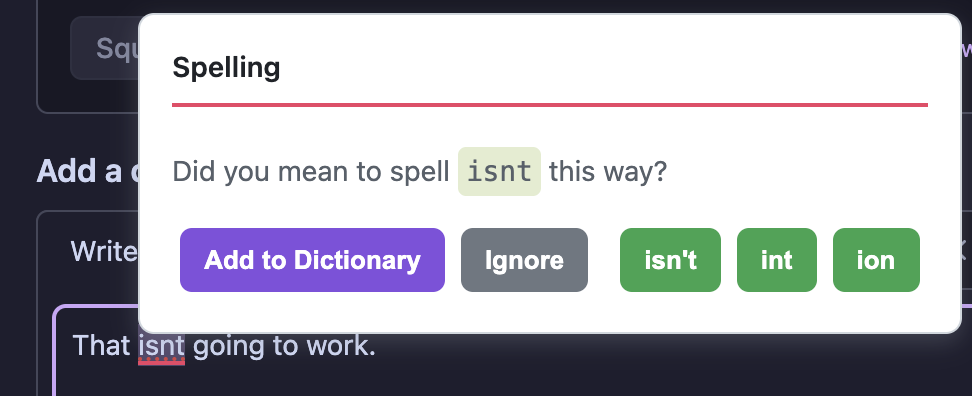
Harper’s Chrome extension has one critical UI element that user’s should be interacting with more than any other: the suggestion box.
| Before | After |
|---|---|
 |
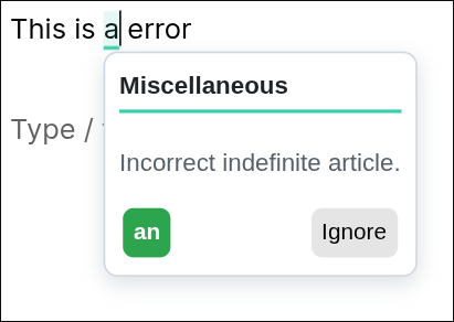 |
When Harper locates a problem in a user’s text, it underlines it and waits for them to notice. When they do, they have the option to click it and review Harper’s suggestion. This is a flow typical of most spell and grammar-checking programs, so you’re likely familiar with it. This process makes the contents and behavior of the suggestion box extremely important for user satisfaction.
After receiving some feedback related to the suggestion box’s visual unpleasantness and difficulty to understand intuitively, I’ve started making some modifications. Nothing drastic—I don’t want to confuse existing users. I’ve focused on making it more compact and use more visual storytelling. Now, when a spelling mistake should be corrected, it shows an icon rather than a full “Add to dictionary” label. I’m already getting positive feedback about the changes.
All-in, it seems like much of the design philosophy of the UI is being pushed further in the direction of Harper’s core tenet: to get out of the way.
Why Quality is Important
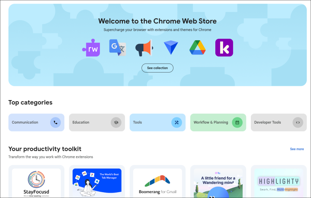
Quality is important for the Chrome extension (more so than other integrations) because of the Chrome Web Store’s front page.
Extensions that get featured on the front page get a significant amount of free advertising. Millions of users view this page monthly. Getting on the page is guarantee of tens of thousands of new users, if not more.
Here’s the rub: you can’t get on the front page by paying for it or by chance. An extension is placed on the front page if and only if it meets a high bar of value and quality. In other words: you have to earn it. This is the essential reason why I’ve been working so hard on Quality these past few weeks: I’m trying to get on the front page.
Most of the steps I’ve taken in this direction are small enough to not be worth mentioning here. If you’re curious, feel free to reach out!
Published May 19, 2025 at 6:00 AM
Proofread by Harper.