Quality Requires Visual Design
Earlier this week, I was looking through a table of user feedback about Harper. I believe that software should be build with the user—not just for the user—so this is a pretty regular ritual for me.
I was delighted.
Many of the usual complaints were totally absent from the report.
Users were encountering fewer of the make-or-break bugs that would harm their experience.
This meant that my recent push to get Harper prepared for a 1.0 release was working.
Great news! Yippee!
Unfortunately, something new emerged from beneath the pile of bugs: problems with Harper's visual design.
For quite some time now, I've been focused solely on the practical parts of Quality. I mean bugs and the hard-to-deny usefulness of Harper's service. In that time, I've forgotten that the visual appeal of the software is at least as important. So, when I saw these complaints with Harper's visual design, I knew I needed to do something about it.
I've never claimed to be a designer, but I'm also not one to shy away from a challenge. So, I grabbed a copy of the Laws of UX (thanks Eduardo, for the recommendation) and got to work.
Bring Everything Together
Here's the secret to Harper's design system: it hasn't really existed until now. Each of the integrations, from the Chrome extension, to the website, and even the Obsidian plugin, had their own design system and appearance. Mostly, this was because I didn't care enough about it when first crafting these projects. Things have changed, so I'm going to take my time and do a good job in an attempt to service these user complaints.
Before I could start tweaking CSS styles, I needed a unified color scheme. After some research and time in the color picker, I arrived at this:
From there, I built out a component library based on Flowbite and replaced all the relevant components in Harper's integrations with my own.
Next, I wanted to create a bit more dynamism with our typography. After spending some time in Google Fonts, I decided to use Domine, a serif font for headings and Atkinson Hyperlegible for everything else. Once I combined the duo with the orange-ish yellow from the color palette (which is usually associated with creative brands), I felt confident that I had nailed what I imagined Harper's personality to be.
Finalizing the Draft
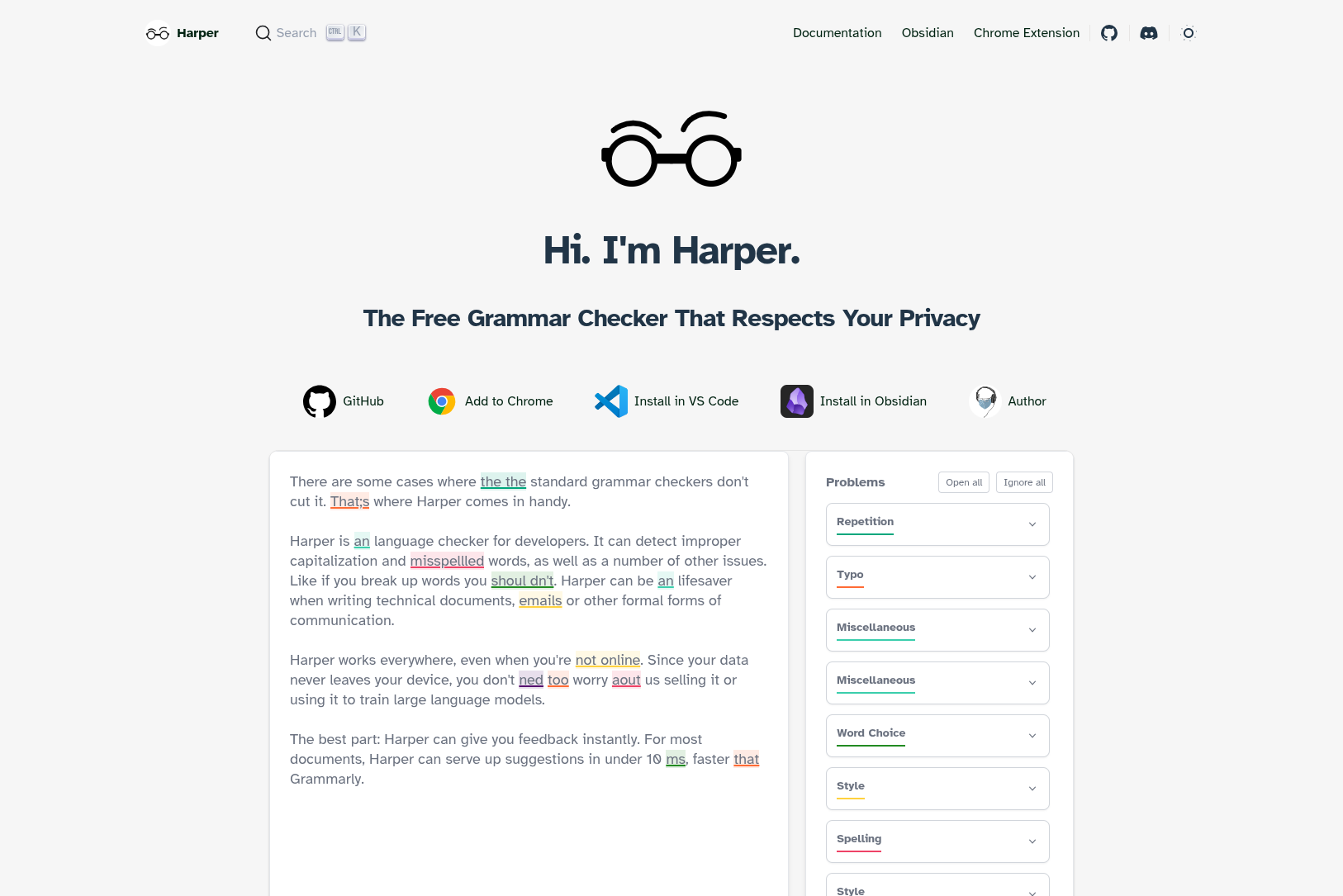
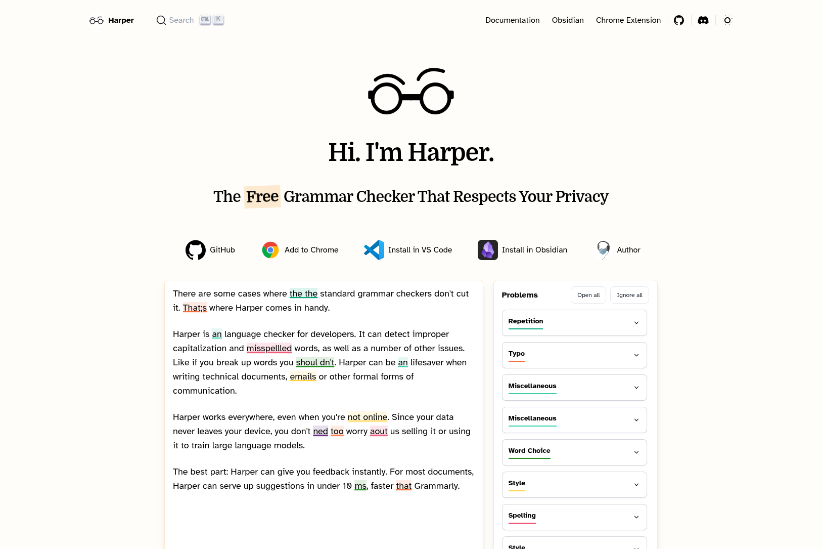
I feel that Harper's landing page embodies the design system well, so I've shown it below. It's the first, and often only, thing a user sees, so I put some extra care into it. At the time of writing, it is live.
Before My Changes
After My Changes
Where Do I Go From Here?
As I said, this mini-project was simply a draft. I'll be working with Harper contributors on a more regular basis to continue nailing it down, slowly improving the Quality of the visual design for the entire project. If you have any feedback, thoughts, or ideas for how we can make Harper more user-friendly or visually appealing, let me know!
Published November 21, 2025 at 7:00 AM
Proofread by Harper.
Comments
Other Stuff
My Writing Environment as a Software Engineer
Writing is one of life's greater joys. It's a mental workout that often brings me a level of clarity that is hard to find elsewhere.
Markov Chains Are the Original Language Models
Back in my day, we used math for autocomplete.
Hacker News sans AI
I like HackerNews, but I don't love that so much of it has turned into discussion of a single topic: AI. This is a version of HackerNews, filtered to remove any article focusing on __AI__. Refreshes about every ten minutes.