

A Better Popup
Arguably the most important part of any Harper integration is the popup window. You know, this thing:
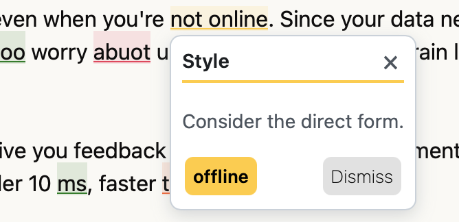
The popup you see above is the one we had available previously for the Chrome Extension. It worked, but it never felt as polished as the underlying operating system’s context menu. In an ideal world, we would surpass the operating system with tasteful flair and functionality. This week, I ripped out that old context menu and replaced it with a better one (see below).
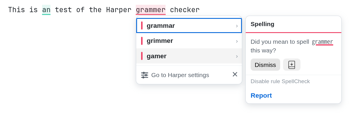
Today, I plan to discuss the evolution of the popup window and why it looks the way it does today. I am a designer in the sense that I occasionally design things, but I do not identify as one nor do I have the real training to be labeled as one. Designing things is really hard. I hold an enormous amount of respect to the people who do it professionally. I must admit that this new design would not have been possible without Claude Design. Part of my intention with this blog post is to do an investigation on what it does so that I might not need to rely on an LLM next time.
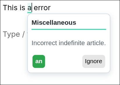
The Original Popup and What Came After
The original suggestion popup for Harper was extremely minimal. It only contained three things after all:
- The suggestion type.
- The description of the suggestion.
- The suggested edits to be made.
It had limited functionality, but it worked. From there, I added buttons to add words to a user’s dictionary and to ignore the suggestion.
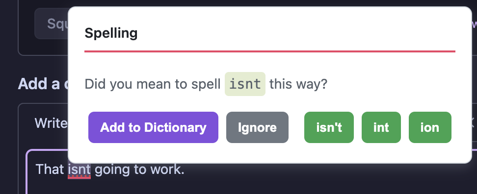
At this point, we realized that the most common buttons to press (the actual suggestions) were being placed in the corner of the popup furthest from the user’s cursor. That cannot do! So we moved it around and improved the styling of the text. That brought us to the popup you saw at the beginning of this post.
And that is where we left it for several months. It was not good enough to be a truly satisfying experience, but it also was not bad enough to warrant changing. Until this week, that is.
So, I decided to make three distinct changes:
I first placed the most actionable buttons closest to the user’s cursor. That meant the top-left of the window, without any border or padding.
Next, I stacked those most actionable buttons vertically, so as to mimic the operating system’s context menu and to allow the least amount of mouse movement to choose an option.
Finally, I decided that all the least used options and information should be made available via a flyout window to the right of the main “context” popup.
After arriving at a rough sketch, I took it to Claude Design. From there, Claude sketched out a few options with varying styles. I chose the one that was closest to the “canonical” design of the Harper macOS app.
And that is how we got to the popup available in the most recent release of Harper:
What “Style” Means
In this context, style means a few things.
For one, it means using a consistent border color, that is neither too light nor too dark, and radius. It should divide the element from its surroundings without demanding more attention than the element’s contents.
For two, it means correctly employing varying degrees of margin and padding to convey a hierarchy within the element. It also means adjusting font weight and size to the same aim.
Published September 18, 2026 at 8:44 PM
Proofread by Harper.




Comments
Other Stuff
Slop Paralysis
A complete or partial loss of function while reviewing the output of a coding agent.
Why I Talk to Myself
It's not easy, but I think it's one of the best habits I've ever built.
Local-First Software Is Easier to Scale
The title of this post is somewhat misleading. Local-first software rarely needs to be scaled at all.